Why color matters in THC beverages
Customers make quick judgments about a beverage before they read the full label. Color helps signal flavor, freshness, intensity, and drinking occasion. A berry drink that looks berry-forward, a citrus drink that looks bright, or a pineapple drink that looks tropical can be easier to understand on shelf.
In THC beverages, color also helps the product feel like a real beverage rather than only a cannabinoid delivery system. That matters for brands that want repeat purchases, retail confidence, and better product photography.
Color should support the beverage experience. It should not make the product look artificial, youth-oriented, or disconnected from the actual flavor system.
Natural color vs artificial-looking color
Some beverage categories use bright artificial-looking color to get attention. That may not be the best direction for a THC beverage brand that wants a premium, adult-oriented product.
Natural color strategy is usually about creating believable color cues. The beverage does not need to look dull. It needs to look intentional, refreshing, and aligned with the flavor.
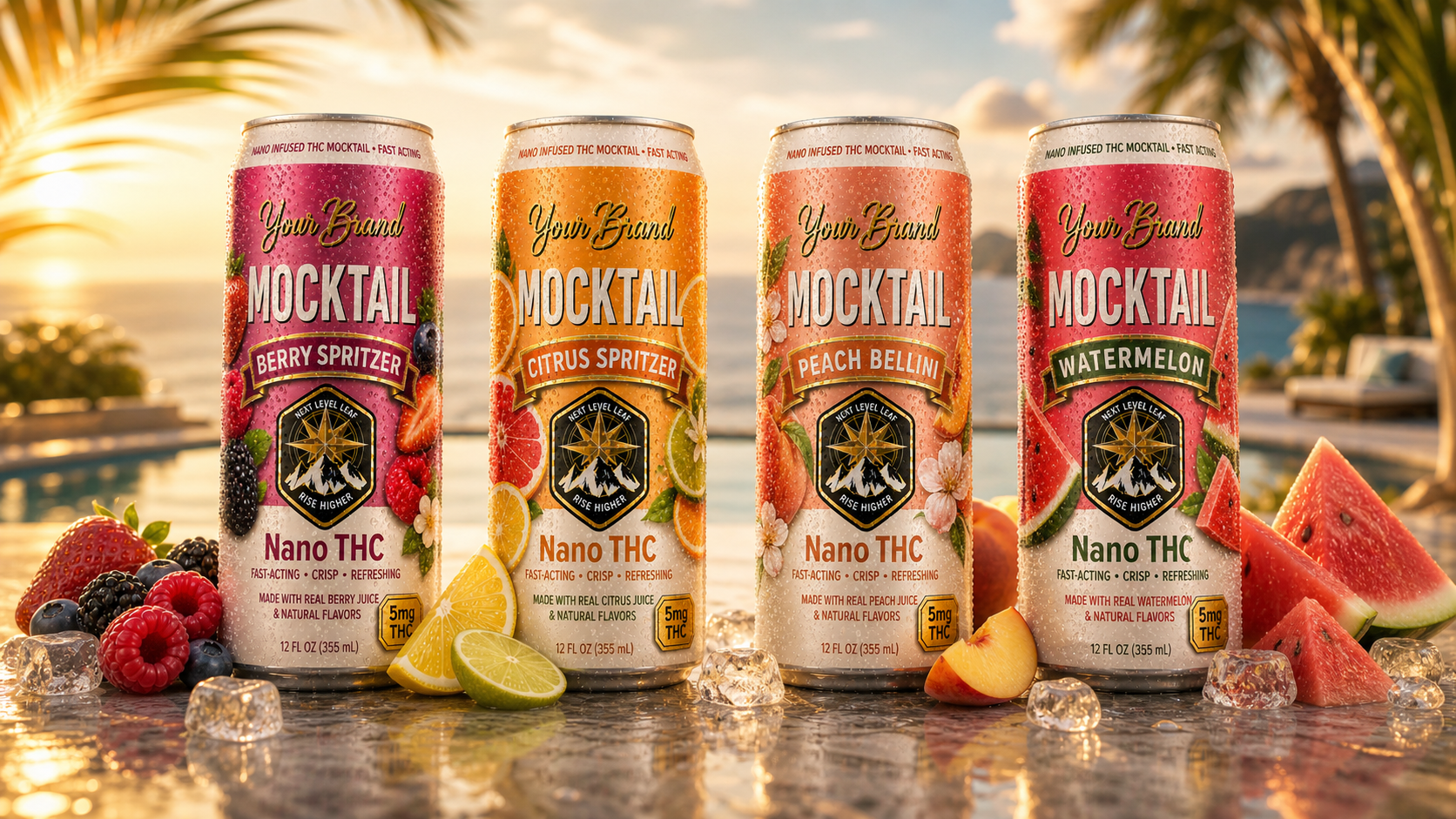
Red, pink, or purple cues
Berry beverages can use color to signal raspberry, strawberry, blackberry, mixed berry, or berry lemonade directions.
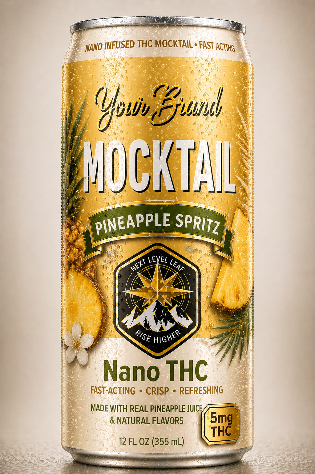
Golden or orange cues
Citrus and tropical drinks often benefit from bright but believable color that supports refreshment.
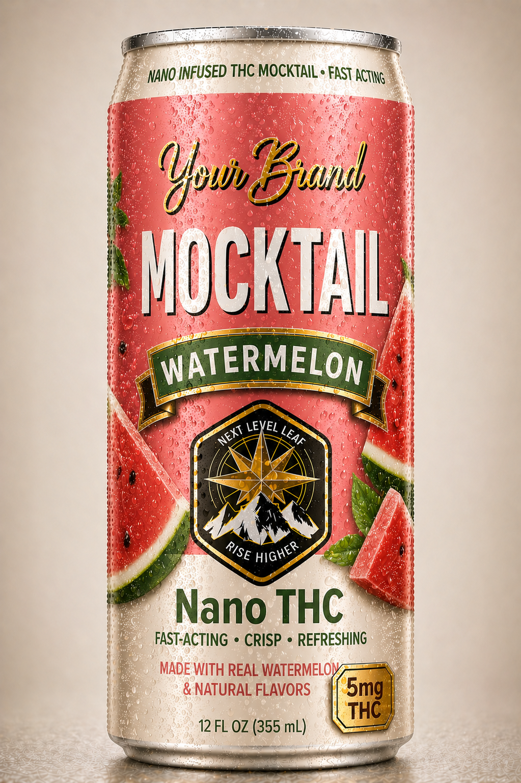
Soft pink cues
Watermelon-style drinks can use color to create immediate flavor recognition without feeling candy-like.
Where natural color can come from
Natural color cues can come from several parts of the beverage system. Fruit juice, puree, botanical extracts, natural color systems, and the flavor base may all contribute to the final appearance.
The right approach depends on the beverage format, flavor, target color, sweetness, pH, shelf-life expectations, and whether the product is still, sparkling, spritzer-style, or mocktail-style.
Fruit puree and juice systems
Fruit puree and juice-inspired systems can help support color, but they also affect the rest of the formula. Puree may add body, texture, sediment potential, and a fuller fruit impression. Juice may support a familiar fruit story while keeping the beverage more flexible.
For spritzers, the challenge is keeping the drink crisp and refreshing while still delivering enough color and fruit identity to make the product feel distinct.
Color stability and shelf-life planning
Color can shift over time. Light, oxygen, acidity, ingredients, packaging, processing, and storage conditions can all affect how a beverage looks after production.
This is why color should be considered during formulation and production planning, not after the brand has already finalized packaging. The product in the can should still match the promise on the label.
If color is part of the product story, it should be treated as a quality-control consideration. The goal is not just a good-looking first sample. The goal is a beverage that looks right through the intended shelf-life window.
Color and adult-oriented packaging
Natural color can make a THC beverage more attractive, but packaging still needs to feel responsible and adult-oriented. Fruit imagery, bright labels, and colorful beverages should not drift into youth-oriented or candy-like presentation.
For THC spritzers and fruit-forward beverages, the strongest direction is usually clean, premium, refreshing, and clear. The package should explain flavor and dose without relying on novelty or excessive visual noise.
Flavor directions that benefit from natural color
Color can be especially helpful when the flavor is easy to understand visually. Berry, citrus, pineapple, peach, watermelon, grapefruit, blood orange, mango, and tropical citrus can all use color cues to support customer expectations.
- Berry Spritzer: red, pink, or purple tones can reinforce mixed berry, raspberry, or strawberry directions.
- Citrus Spritzer: orange, gold, or pale citrus cues can help the drink feel crisp and refreshing.
- Pineapple Spritz: golden tropical cues can support the flavor story quickly.
- Peach Bellini-Inspired: soft peach tones can help the product feel elevated and occasion-based.
- Watermelon: a softer pink cue can be refreshing without feeling candy-like.
- Blood Orange or Grapefruit: deeper citrus tones can make the beverage feel more premium and adult.
Testing, COAs, and product trust
Natural color does not replace the need for finished-product testing, dose verification, batch-specific COAs, label accuracy, and quality-control documentation. If the beverage uses fruit systems that affect color or appearance, the product plan should also consider consistency from batch to batch.
Clear documentation can make retailers, distributors, and customers more comfortable with the product, especially when the brand is entering multiple states or channels.
What to prepare before requesting a quote
A natural color THC beverage quote is easier to scope when the brand can describe the flavor, visual goal, format, and production direction. You do not need a finished formula, but the product vision should be specific enough to evaluate.
- Flavor direction, such as berry, citrus, pineapple, peach, watermelon, mango, grapefruit, or blood orange
- Desired color or appearance
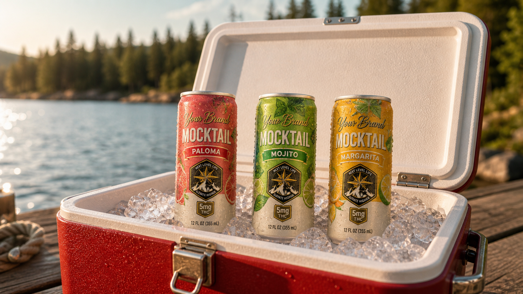
- Still, sparkling, spritzer-style, or mocktail-style format
- Natural flavor, juice, puree, or blended fruit system preference
- Target THC or cannabinoid dose per can
- Sweetness, calorie, clarity, and mouthfeel goals
- Can or bottle size and packaging status
- Target states, first-run quantity, and timeline
Where to go next
If you are exploring the parent category, start with THC Fruit Spritzers. If you want a stronger fruit system, read Fruit Puree THC Drinks. If you want a lighter sparkling version, review Real Fruit THC Seltzers. If your visual and flavor direction is clear, the next step is to request a quote.